Gallerie Modern - MCM Within Reach
An experience and brand design journey from ideation & user research to live brand identity, collaborative design system & website prototype.
Scroll ↓

Problem Statement
Gallerie Modern is an accessible and affordable web shopping option for consumers who want stylish furniture at a reasonable price point. The two-day time constraint was a test for me, as I sprinted to deliver as much of the brand and web experience as I could design in the time.
The “Why”
This project is the result of a recent design challenge I participated in, and I was the sole personnel and designer throughout.
Within a two-day time limit, I opted to craft a simple web experience.
Deliverables, I decided, would include a full component system and website prototype, for a brand which I would also create from scratch. The brand would be based on a logo I designed years ago–a starting point from which I was glad to finally build. I spent about 14 hours on this project.
For this design system, I was inspired by high-end furniture designers and pieces, and I took a fun approach to the Mid-Century Modern furniture style, to try to make what’s usually an out-of-reach sense of style more accessible to people who want quality items that also look great. Below are personas, user journeys, and user stories.
Click through here to explore my Miro file.
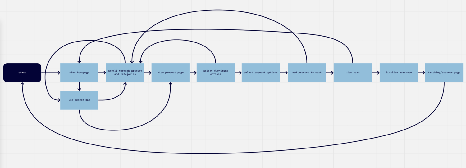
User Research
User Research
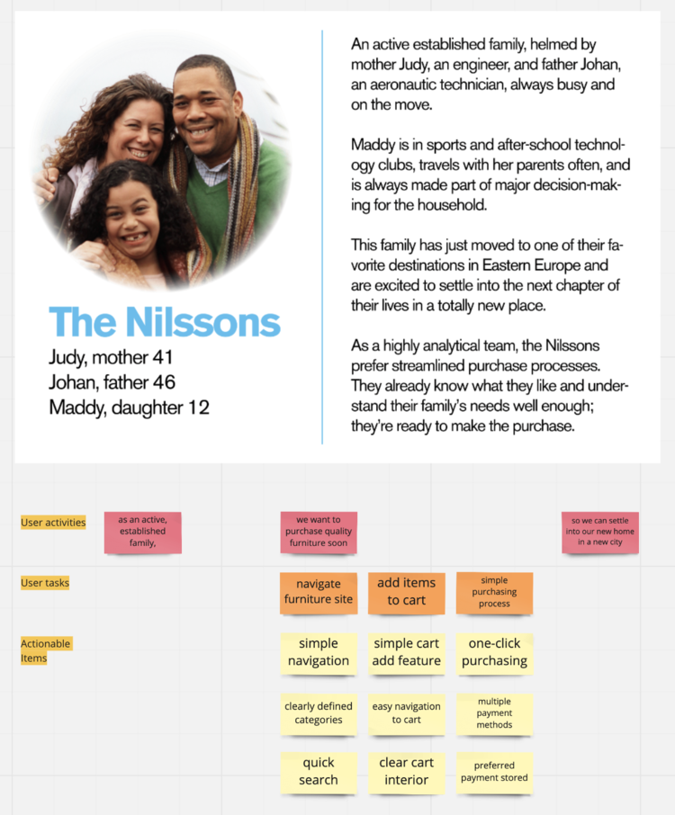
This system itself began as most projects with defining and understanding the users, albeit in a bit of an abbreviated process here.
I’ve described two personas of the Nilssons and the Robertses, two different families trying to accomplish different goals with the product. I’ve laid out their personas, journeys, and story maps in Miro. These gave me a good understanding of our human users, their needs, and the start of a game plan to deliver experiences that work for them.

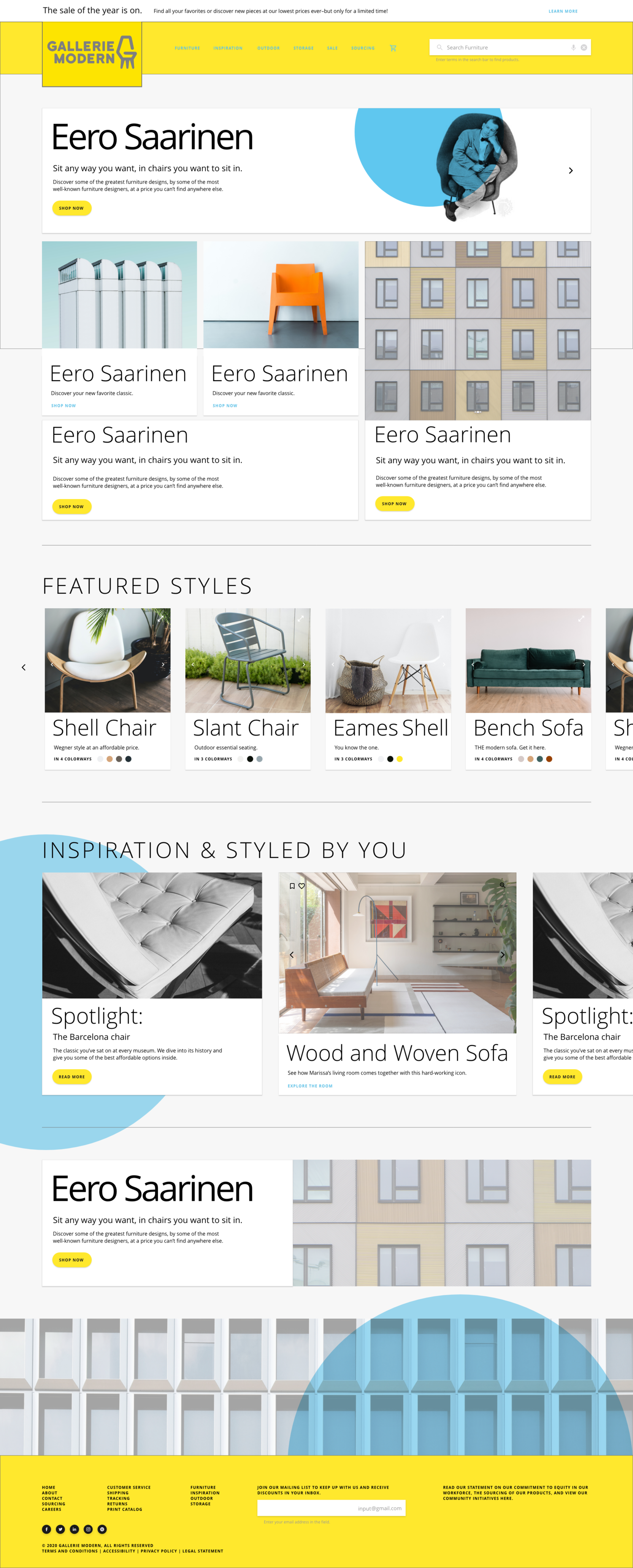
Gallerie Modern Design System
Gallerie Modern Design System
These elements are the basis for functionality throughout the site. Expand to read more. Click through images for full Design System.
-
Typography reflects the designed furniture structures that will be sold on the site, for which I bounced ideas around a few type stacks until settling into the one that best delivers the accessible and fashionable appearance I was looking for. For this project I used varying weights of Open Sans, with modified kerning and leading.
Based on this typography, I created a type scale according to a modified Golden Ratio for screen legibility, inspired by Google’s Material Design.
I used REM scaling with a base of 16px for body copy to generate each level in my type hierarchy, adjusting kerning and leading for extremes, and identifying headers, subtitles, body copy, buttons copy, etc.
For this project, I’ve developed a style guide for typography and adaptable type lockups. I created easy-to-use block measurements with the multiplier for quick implementation across design and development teams.
Also shown are mock typographic lockups as they may appear on the site when it’s developed later.
With more time on this project, I would have explored a few variants for native screen sizes, just to make things a little easier for developers and myself.
-
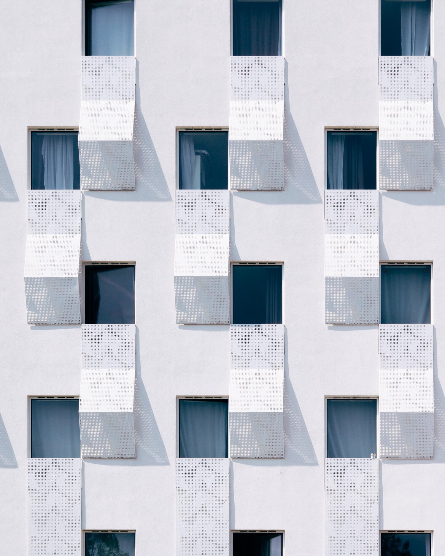
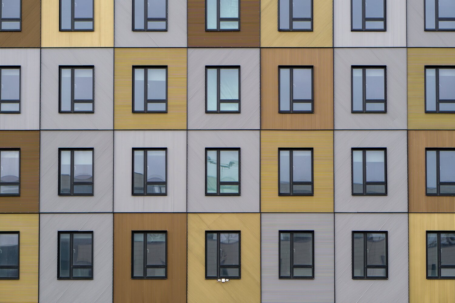
Corresponding with my ideas about the original logo and brand, I wanted a play on the ITS or International Typographic Style in structure and on De Stijl in color, both staples of Mid-Century design.
This makes color decisions and structure simple, as we’re going with primaries, grids, legibility and usability at the forefront.
Of course, I’ve deviated a little to give the brand its own flavor. But I’ve put together a color palette guide you can see here, including a couple use case examples we’d find on the website.
-
Here are CTA’s with guidelines for different states, which I loosely modeled on Material Design due to time restraints and the fact that they are truly experts in the field and I trust them as a baseline.
I included a few button states, but if I had more time I would be more accommodating and assess the needs for each of these on more of a case-by-case basis, to be sure I’m delivering components that are making the experience better for users in the end.
Some of the choices I’ve made here include incorporating our color palette as an opportunity to further the brand messaging and allowing for various states like hover and active.
Components reflect the general brand style and they translate that messaging to the web product for a more tactile consumer understanding of and interactions with the brand.
-
Since the goal of this site is to make stylish furniture more accessible, I did want to design some features for accessibility. This is why I’ve included a voice option in search and I use bold color choices to show available options, as well as helper text to clearly describe what is needed from the user when filling these out. The same goes for other fillable text fields, and I’d expand on these with more time.
-
Briefly, I’ve laid out guidelines for iconography.
For the sake of time, I have not designed these icons from scratch, but I’ve included some of the more common choices as a jumping-off point to expand upon with the input of a team as this project would move forward in a real-world design process.
These icons are from Google’s Material Design.


Gallerie Modern Brand Identity
Gallerie Modern Brand Identity
I designed the Gallerie Modern logo years ago as a standalone concept. It incorporates a mid-century styled fiberglass shell chair reference (Eames) that also gives the illusion of a “g” and “m” to match the name of the brand.
The modified typeface used here is Bungee.
I imagined it on yellow, or other primaries, with the logo itself in a gray. This logo was a great jumping-off point to build out a brand.

This brand board incorporates some initial ideas I had for typography and color, overlays and shapes, as well as photographic and other visual elements for use on the website and beyond.
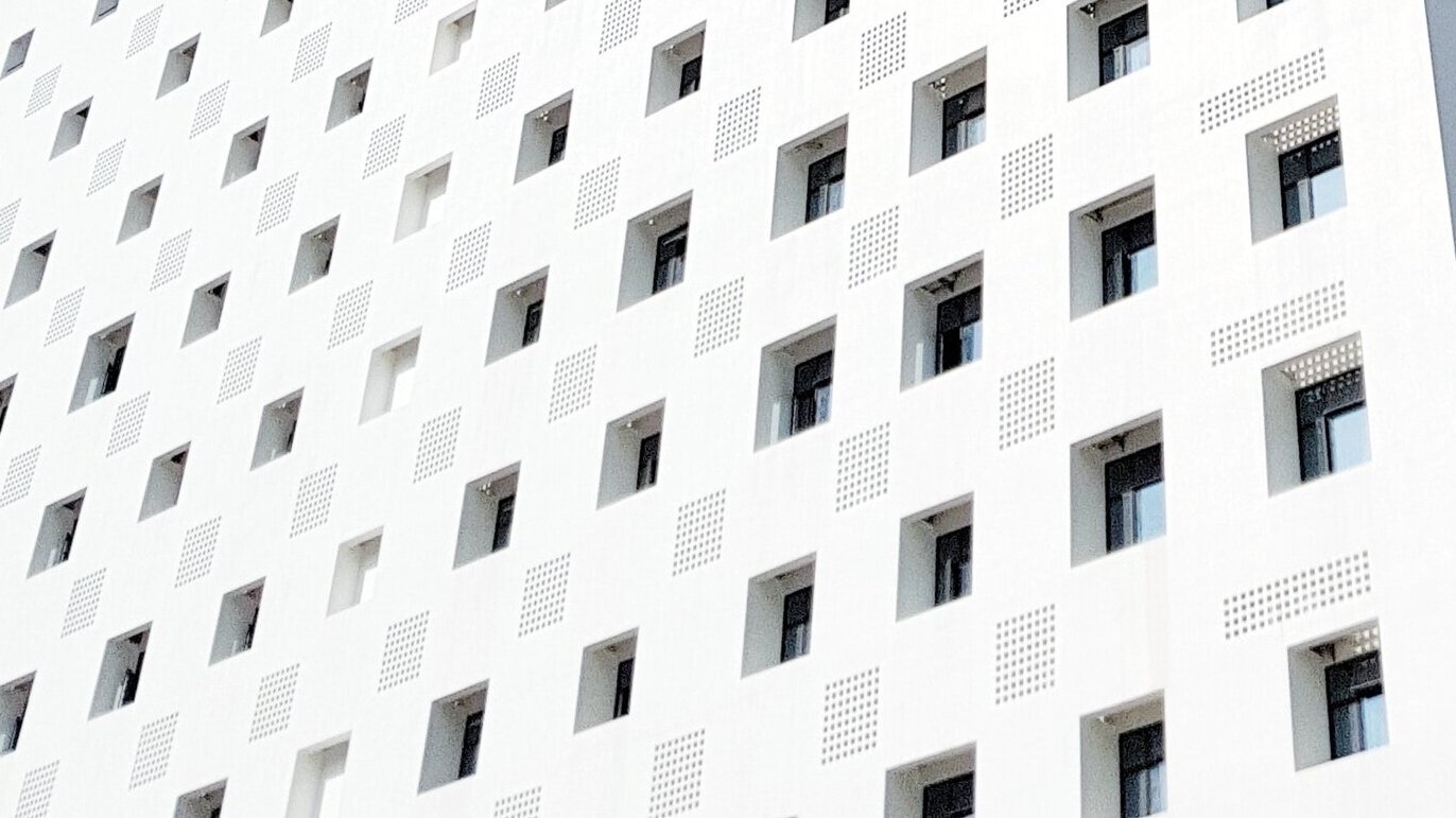
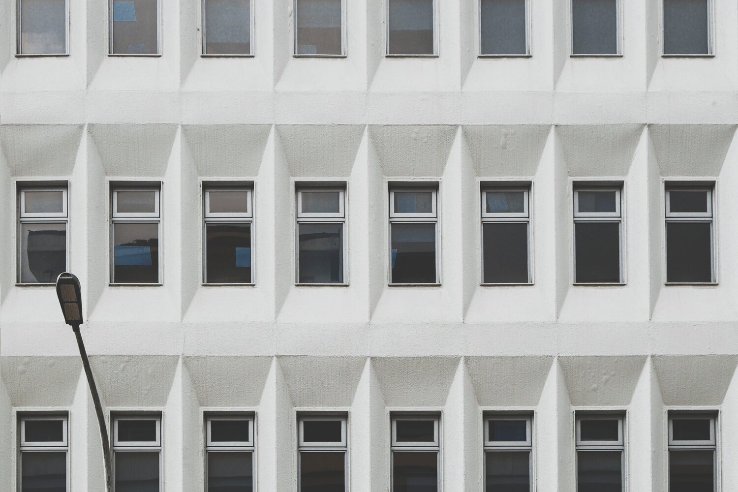
Heavily inspired by International Style architecture and Mid-Century furniture forms, the board developed unity through use of a grid, repetition, and primary colors. These formed the basis as I built out the brand.
Click through to see the brand translate into a design system.
Retrospective
Retrospective
While the goal of this sprint was to
(1:) deliver a functional design system and collaborative component library, and
(2:) show how I use programs to communicate with design and development teams,
I made sure to also take the time to build out a brand to show that skillset in the best light.
If I had more time or resources with a team, I’d love to explore more iconography, custom illustrative assets, more options for accessibility including dark mode, responsive and mobile sized prototypes, and especially more focus on animation, states, and micro-interactions.
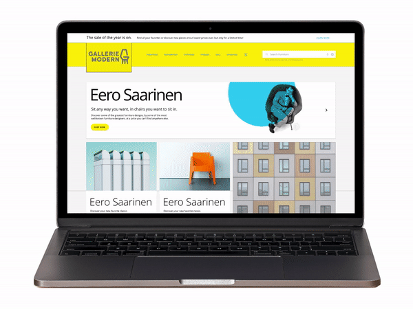
View the working prototype below!
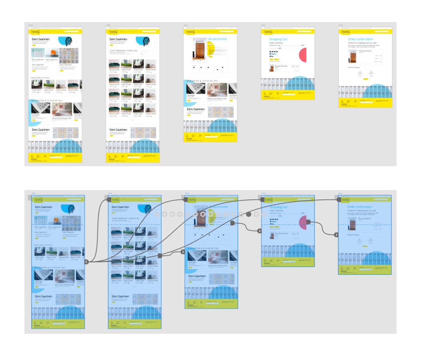
Toolbox
I used Miro for early user segmentation and mapping. Design ideation and iteration was done by pen and paper and digitally in Adobe programs for wireframes, color palette, and typographic solutions. I found inspiration and icons in Google’s Material Design, the International Style/De Stijl, and found photography on Unsplash. I designed the brand board in Adobe Illustrator. Prototyping was done in Adobe XD, utilizing cloud-based libraries for easy use across teams.
Links
Explore each aspect of this project in-browser, no account logins or external programs needed:
-Design system/component master working file with communication/markups for team
-Website prototype I made using my design system in Adobe XD
-User Stories and Journey Mapping in Miro